
Designing a Logo
I’ve always had my toes in design. As a full stack engineer, it’s important to have some amount of design sense.
That can be pretty hard.
I named the blog ‘Hackily’ on a whim, after quickly searching Google to see if anybody else had claimed the name. It turns out, some company had bought it and is waiting until someone shells out the dough for it.
Unfortunately, the funding I have for this blog is $0.
The motif that caught my eye in ‘Hackily’ was the ‘ily’ part, and I found it fitting - you can decompose ‘Hackily’ into ‘hack’ and ‘i love you’, which fits thematically in the vision I have for this blog, which is to share the knowledge I learn from hacking.
I immediately started conjuring mental images of what I wanted. Maybe the ‘y’ could wrap around the “ily’ part and create a heart?
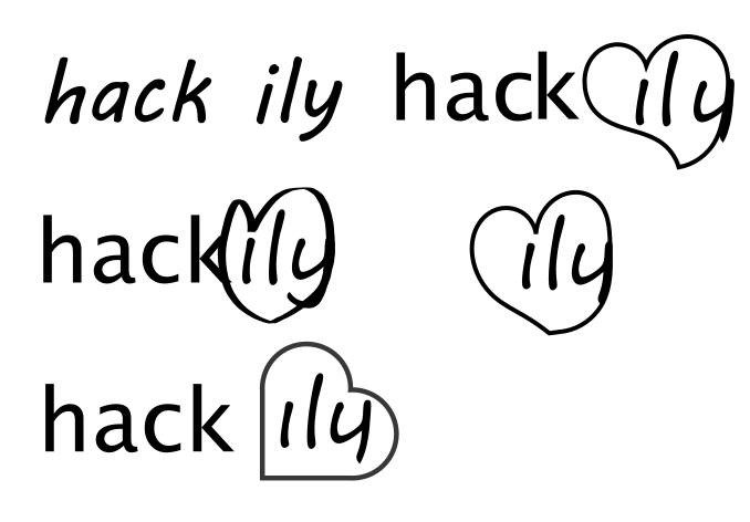
It’s a start! The important thing is to throw a lot of ideas on paper, and then slowly iterate.
What struck me was that a heart composed of a square and two semi-circles looks pretty similar to elements in what we traditionally recognize as the cloud icon.


After deciding on the cloud design, the next step was identifying how to incorporate the text into the image, and to pick a color scheme. I tried my hand at a couple, and gathered some feedback.

An invaluable resource when picking a color palette is the Encycolorpedia. You can provide it any hex color code, and it will generate for you information about the color.
What does it look like when it’s web-safe? How would different different color-blindnesses affect the perception of that color? What are some color combinations that harmonize well with that color? How about some related colors? Or what it looks like as a text color on a black background, or as a colored background, in a gradient, and used with its complementary color?
These are questions that are difficult to answer, even if someone has a good design sense.
Ultimately, I settled upon this logo.

The little heart softens the edge where the two heart-components join, and evokes a subtle imagery that reminds the user that the cloud is composed of two hearts, without being blindingly obvious.
What do you think?
Leave a Comment